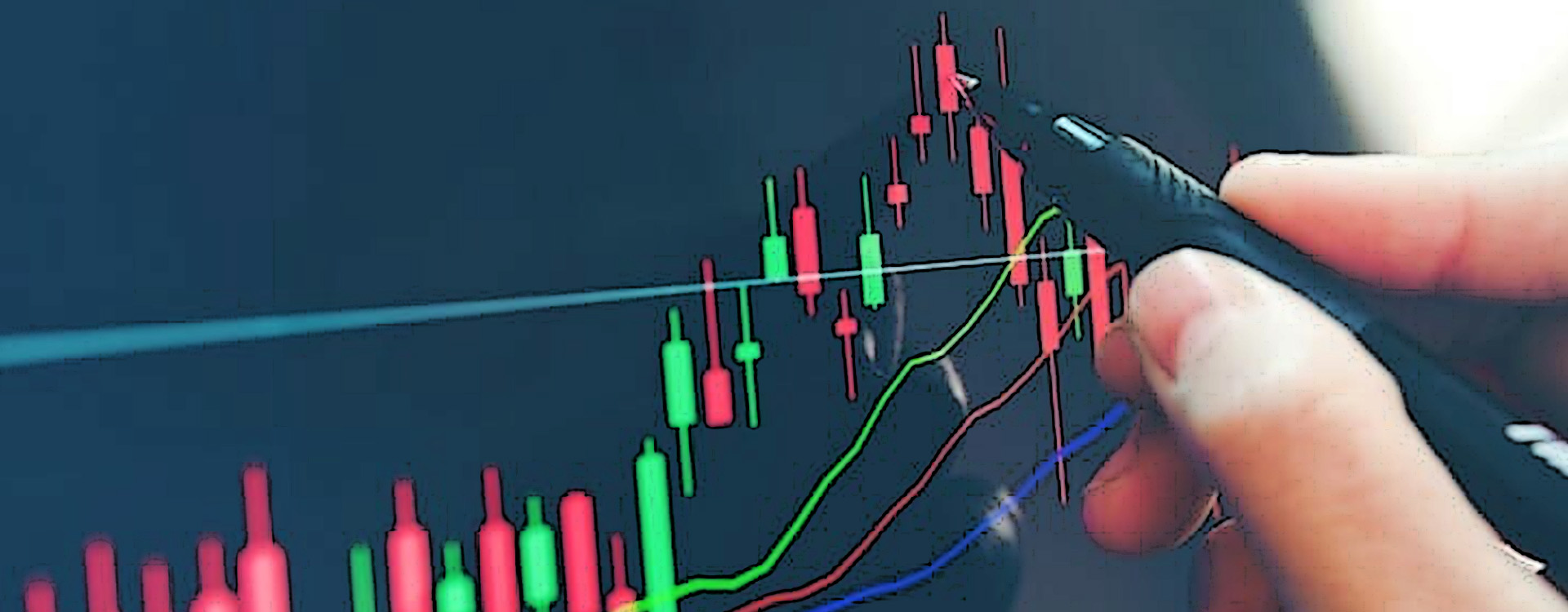
To understand a stock market chart and stock selection, the first important task for beginners is to read stock charts. If you are even minutely familiar with investing, you might agree that reading stock charts is neither easy nor very much enjoyable. But it is an essential skill that is necessary to generate future profits on the stock market.
Stock charts and their readability are part of the technical analysis of the market’s investment strategies and processes. It primarily gives you an overview of the current value of an investment and how it has changed over time.
What is the share market chart?
Whether it’s a stock chart or a technical share chart, they all play a vital role in identifying current trends and reversing trends. The share market chart is a unique format that can generate trading signals and show future price trends on a chart.
‘‘
You can consult the chart and view stock prices over periods if you want to see each item's final price on each trading day.
Volume (Quantity) and Price
Stock charts are divided into two main areas: price and volume. The volume represents the quantity and the number of shares traded on the market. You have to look at both merit (price) and magnitude (volume) to understand the fundamental nature of particular markets and shares.
For example, if a stock falls 2% per day, you may panic. It means that if trading volumes are well below average, the major investors in the market may not be actively selling. Conversely, if a stock is performing well but the number of shares traded is deficient, it simply means they are fake.
Types of charts
Bar Charts
These are the most standard charts for stock market traders and investors. Bar Charts provide various important information about the transactions related to the securities and their prices. The details include the opening price, the closing price, the high price and the low price on a particular day.
Line Chart
This is a chart that tracks daily closing prices. It is plotted daily and eventually forms a line.
Candlestick Chart
Candlestick charts (also known as Japanese Candlestick charts) display price data in various formats divided into two parts, with each piece plotted on a line. The thin line shows the price range between high and low, and the current unit shows a large area, which helps calculate the difference between the closing price and the opening price.

Head and Shoulder Chart
The head and shoulder chart is a tabular table model that shows the changes in securities, i.e., their volatility against previous market trends. The top of the trend forms the chart’s top, and the bottom marks the end of the trend. The bottom line is also known as the descent and reverse signal.
Reading stock market charts
Recognise the chart
Identify the charts at the top. A ticker designation or symbol, a short alphabetic identifier of a company, is located here. It is essential to have a correct sign while looking for the company’s information.

Select a period
This can be daily, weekly, monthly or yearly, depending on which period you want to access on the chart. Examining different timescales helps identify long-term and short-term trends and verify stability.
Watch the prices
A typical chart is divided into two parts, one above and one below, with information about the prices. Prices are generally shown in different colours; for example, the marker might be black if the closing price for the period is lower than the opening price. Whereas the chart may mark the price at which the stock closed in the red.
Check the summary key
You should always check the summary key as it contains essential information about the market that can be quickly read from charts. The details generally include the most recent price, the moving average price and the transaction volume.
Keep in mind the volume traded
Below a chart, you can see the number of shares traded in the market. The coloured area helps determine whether there is a positive or negative trend in the market. The colour code is not fixed, so read it carefully. The colour represents an increase or decrease in the closing price from the previous day’s closing price.
This is the most basic pathway for new investors learning to read the stock market trends and figures via graphs. By following this technical route and mixing it with the fundamental analysis of a company’s books, shares, management, etc., you can devise a practical investment strategy by starting small in the investment world.


